
vue项目实战之alone-admin(三):项目基本布局搭建
到这一节,我们就算是真正的开始撸代码了,其实说撸代码,倒不如说是开始“搬砖”了,为什么这样说,跟着往下走,慢慢的你就能体会到了。
alone-admin要搭建怎样的布局?
对于后台管理系统的结构,一般都是最上面的header和侧边导航栏组成,现在我们同样也采用这样的结构,不一样的是,我们这次alone-admin后台管理系统,一定会符合新现代的审美标准,颜值超高。好了,说这么多,不如直接上图。
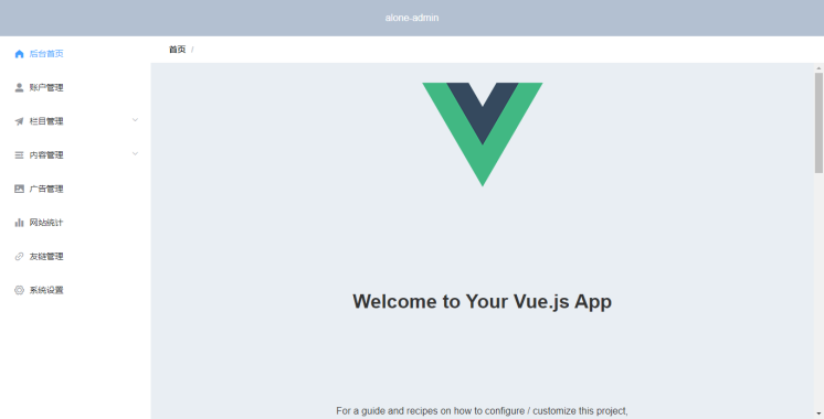
这是这一节结束之后,alone-admin的模样,现在颜值应该也不差吧,值得一说的是,通过后期不断的完善,alone-admin后台管理系统的颜值还将会倍增!你们期待吗?看完上图,相信你也随之明白了alone-admin后台管理系统是怎么样的结构,这就不再多啰嗦了,下面直接代码实战。
代码实现
首先,我们先来总体的去看一下,最上面的header很简单,还有就是最左边的侧边导航栏了,再右边就是内容区域了。结构很简单,经过分析之后,我们可以在 app.vue 这个文件中写这个基本布局了,因为我们所有的路由都是基于这个布局的,所以写在 app.vue 文件中还是很合适的。然后最上面的header和侧边导航栏,我们采用组件的方式引入(不能把所有代码都写在app.vue中,这样太不优雅了哈)。下面开始了哦。
一、引入公共css
我们可以在每一个vue文件中,直接写css样式,但是这样做的结果就是打包编译的时候会形成多个css文件(一个vue文件对应一个css文件),这样加载的时候就很占用带宽了,并且影响加载速度。所以本人不太喜欢直接在vue中写css样式,所以要引入公共css文件,写样式的时候我们就写在这一个文件中就行了,个人很喜欢这种方式。当然也许能通过配置将css打包编译时合成一个文件,但博主还是较喜欢直接引入公共css样式的方法。至于引入公共css的方法,请参考博主的个人博客文章K先生:vue引入公共css文件最简单的一种方法,很简单,这里就不在多说了。
我们这里引入了两个css文件一个是normalize.css另一个是base.css,其中normalize是抹平不同浏览器的默认样式差距,自己官网下载吧http://necolas.github.io/normalize.css/
另外base.css的内容如下:
html,body {
	height: 100%;
}
.el-container {
	height: 100%;
}
.el-header {
	background-color: #B3C0D1;
	color: #333;
	text-align: center;
	line-height: 60px;
}
.el-aside {
	background-color: #D3DCE6;
	color: #333;
	text-align: center;
	line-height: 200px;
	overflow: hidden;
}
.el-main {
	background-color: #E9EEF3;
	color: #333;
	text-align: center;
	line-height: 160px;
}
.el-menu-vertical-demo:not(.el-menu--collapse) {
	width: 250px;
	min-height: 400px;
}
.el-menu {
	height: 100%;
	border-right: none;
}
.aside {
	height: 100%;
	position: relative;
	text-align: left;
}
二、侧边栏的实现
我们在components目录下新建 Aside.vue 组件,这个组件我们用来实现最左边的侧边栏,内容如下:
<template>
	<div class="aside">
		<el-menu default-active="/index" class="el-menu-vertical-demo" @open="handleOpen" @close="handleClose" :collapse="isCollapse" :router='true' :unique-opened="true">
			<el-menu-item index="/">
				<i class="el-icon-s-home"></i>
				<span slot="title">后台首页</span>
			</el-menu-item>
			<el-menu-item index="/about">
				<i class="el-icon-user-solid"></i>
				<span slot="title">账户管理</span>
			</el-menu-item>
			<el-submenu index="3">
				<template slot="title">
					<i class="el-icon-s-promotion"></i>
					<span slot="title">栏目管理</span>
				</template>
				<el-menu-item-group>
					<el-menu-item index="3-1">栏目列表</el-menu-item>
				</el-menu-item-group>
			</el-submenu>
			<el-submenu index="4">
				<template slot="title">
					<i class="el-icon-s-unfold"></i>
					<span slot="title">内容管理</span>
				</template>
				<el-menu-item-group>
					<el-menu-item index="/">文章管理</el-menu-item>
					<el-menu-item index="4-2">标签管理</el-menu-item>
				</el-menu-item-group>
			</el-submenu>
			<el-menu-item index="5" route="/about">
				<i class="el-icon-picture"></i>
				<span slot="title">广告管理</span>
			</el-menu-item>
			<el-menu-item index="6" route="/about">
				<i class="el-icon-s-data"></i>
				<span slot="title">网站统计</span>
			</el-menu-item>
			<el-menu-item index="7" route="/about">
				<i class="el-icon-link"></i>
				<span slot="title">友链管理</span>
			</el-menu-item>
			<el-menu-item index="8" route="/">
				<i class="el-icon-setting"></i>
				<span slot="title">系统设置</span>
			</el-menu-item>
		</el-menu>
	</div>
</template>

<script>
	export default {
		data() {
			return {
				isCollapse: false
			};
		},
		methods: {
			handleOpen(key, keyPath) {
				console.log(key, keyPath);
			},
			handleClose(key, keyPath) {
				console.log(key, keyPath);
			},
		}
	}
</script>

<style>
</style>
里面都是element-ui的标签,所以还需要结合element-ui的文档去看,这里就不多说了,不明白代码的直接去看文档,差不多也都是从文档复制过来的。这个组件完成之后,我们接着往下看。
三、基本布局的实现
上面侧边栏组件实现之后,我们打开app.vue这个文件,我们参照element的文档,开始实现基本布局,最终的的代码如下:
<template>
	<div id="app">
		<el-container>
			<el-header>
				<p style="color: #fff;margin: 0;">alone-admin</p>
			</el-header>
			<el-container style="overflow: hidden;">
				<el-aside width="250">
					<Aside />
				</el-aside>
				<el-container style="flex-direction: column;">
					<el-breadcrumb class="bread" separator="/">
						<el-breadcrumb-item :to="{ path: '/' }">首页</el-breadcrumb-item>
						<el-breadcrumb-item v-for="(item,index) in $route.meta" :key="index">{{item}}</el-breadcrumb-item>
					</el-breadcrumb>
					<el-main class="guncss" style="height: 100%;">
						<router-view/>
					</el-main>
				</el-container>
			</el-container>
		</el-container>
	</div>
</template>
<script>
	import Aside from '@/components/Aside.vue'
	export default {
		components: {
			Aside
		}
	}
</script>

<style>
	#app {
		font-family: Avenir, Helvetica, Arial, sans-serif;
		-webkit-font-smoothing: antialiased;
		-moz-osx-font-smoothing: grayscale;
		text-align: center;
		color: #2c3e50;
		height: 100%;
	}

	#nav {
		padding: 30px;
	}

	#nav a {
		font-weight: bold;
		color: #2c3e50;
	}

	#nav a.router-link-exact-active {
		color: #42b983;
	}
	.bread{padding: 15px 30px;background-color: #fff;}
</style>
这里面差不多也都是直接从element-ui官方文档中复制过来的,当然,其中做了些许改动,所以有看不懂的直接看element文档即可。在这里,我们已经把侧边栏已经以组件的形式引入使用了。
还有一点需要注意的是,其中的el-breadcrumb标签内容是面包屑导航,这个需要搭配在路由文件中做些许变动,可以参考博主的个人博客中的文章vue利用路由meta轻松实现面包屑导航去实现。
最后附上github项目地址:https://github.com/pmb2020/alone-admin
作者:K先生本文地址:http://www.gold404.cn/info/113
版权声明:本文为原创文章,版权归 K先生个人博客 所有,欢迎分享本文,转载请保留出处,谢谢!
文章评论
评论列表