
nuxt3实战之alone-blog(五):封装响应式菜单导航栏组件
K先生
爱技术4149
几乎所有的网站都会有导航菜单栏,那么封装一个菜单导航栏组件对于alone-blog就很有必要的,后续用alone-blog开发其他企业官网或个人博客时,就能嘎嘎直接上了,考虑到现在很多需求都是PC端+移动端,那么就搞个响应式的吧。
还有就是这次实现的菜单导航栏组件不只是响应式的,而其还支持悬浮下拉菜单,看效果:
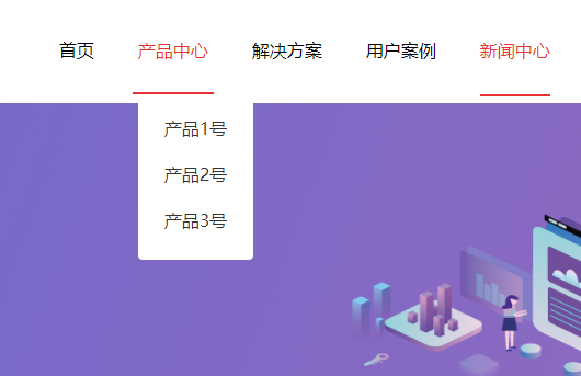
移动端效果就不展示了,目前没有做太复杂,后续会慢慢优化的。下面上代码:
<template>
	<nav class="nav-bar">
		<ul class="nav">
			<li v-for="(nav,index) in data" :key="index">
				<div class="nav-item">
					<div class="nav-item-title">
						<nuxt-link  @click="navClick(index)" :class="{'active':navIndex==index}" :to="nav.link">{{nav.name}}</nuxt-link>
					</div>
					<!-- 下拉菜单 -->
					<div v-if="nav.children" class="dropdown-content">
						<div class="dropdown-menu">
							<div v-for="(navChildren,navChildrenIndex) in nav.children" class="menuItem" :key="navChildrenIndex">
								<nuxt-link :to="navChildren.link">{{navChildren.name}}</nuxt-link>
							</div>
						</div>
					</div>
				</div>
			</li>
		</ul>
		<!-- 移动端 -->
		<ul class="nav-m" :class="{'collapse':isCollapse}">
			<li v-for="(nav,index) in data" :key="index">
				<nuxt-link  @click="navClick(index)" :class="{'active':navIndex==index}" :to="nav.link">{{nav.name}}</nuxt-link>
			</li>
		</ul>
		<button @click="isCollapse ? isCollapse=false : isCollapse=true">三</button>
	</nav>
</template>

<script setup>
	const {data} = defineProps(['data'])
	const navIndex = ref(0)
	const isCollapse = ref(true)
	onMounted(() => {
		navIndex.value = localStorage.getItem('navIndex') || 0
	})
	const navClick = (index) => {
		localStorage.setItem('navIndex', index)
		navIndex.value = index
		isCollapse.value = true
	}
</script>

<style lang="scss" scoped>
	$header-height: 80px;
	@media (max-width:576px) {
		.nav-bar{
			.nav{
				display: none !important;
			}
			.nav-m{
				display: block !important;
			}
			button{
				display: block !important;
			}
		}
	}
	.nav-m{
		position: absolute;
		z-index: 99;
		background-color: #fff;
		left: 0;
		right: 0;
		top: $header-height;
		padding: 1rem;
		overflow: hidden;
		a{
			padding: 0.8rem 1rem;
			display: inline-block;
		}
		.active{
			color: $primary-color;
		}
	}
	.nav-bar{
		.nav-m{
			display: none;
		}
		button{
			display: none;
		}
	}

	.nav {
		position: relative;
		display: flex;
		width: 100%;
		height: $header-height;
		line-height: $header-height;
		.nav-item {
			position: relative;
			margin: 0 20px;
			cursor: pointer;
			// transition: all 0.3s linear;
			a{
				display: block;
			}
			.nav-item-title {
				position: relative;
				display: block;
				height: inherit;
				width: inherit;
				.active{
					color: $primary-color;
					border-bottom: 2px solid $primary-color;
				}
				&::before {
					content: "";
					position: absolute;
					bottom: 0;
					left: -5px;
					right: -5px;
					height: 2px;
					// width: 100%;
					background-color: $primary-color;
					transform: scale(0);
					transition: all 0.4s linear;
				}

				&:hover {
					color: $primary-color;
					&::before {
						transform: scale(1);
					}
				}
			}

			&:hover .dropdown-content {
				height: 300px;
			}
		}

		// 下拉菜单
		.dropdown-content {
			position: absolute;
			top: $header-height; // 为导航栏高度
			left: 0; // 设置为0, 不然会直接定位到父元素下方
			// width: 300px;
			height: 0; // 下拉初始高度
			overflow: hidden;
			transition: 0.6s;

			.dropdown-menu {
				padding: 10px 8px 15px;
				color: #fff;
				background-color: #fff;
				border-radius: 4px;

				.menuItem {
					width: 100%;
					height: 42px;
					white-space: nowrap;
					padding: 0 16px;
					font-size: 16px;
					line-height: 42px;
					color: #333;
					cursor: pointer;
					transition: all 0.3s ease-in-out;
					border-radius: 4px;

					&:hover {
						background-color: #ccc;
					}
				}
			}
		}
	}
</style>
对了,还有怎么使用这个封装的组件:
<template>
	<header class="header">
	    <AloneNavBar :data="navList" />
	</header>
</template>

<script setup>
	const navList = ref([
		{name:'首页',link:'/'},
		{name:'产品中心',link:'/',children:[
			{name:'产品1号',link:'/'},
			{name:'产品2号',link:'/'},
			{name:'产品3号',link:'/'},
		]},
		{name:'解决方案',link:'/'},
		{name:'用户案例',link:'/'},
		{name:'新闻中心',link:'/news'},
		{name:'关于我们',link:'/about'},
	])
</script>
其中AloneNavBar是这个封装的组件名称,给他传递data数组就行了。
上面就是封装的响应式菜单导航栏组件完整源码了,里面使用nav标签是为了更好的SEO效果,还有此组件不只在nuxt3中可用,在vue3中也可,有需要赶紧复制吧。
最后附上GitHub地址(欢迎star):https://github.com/pmb2020/alone-blog
作者:K先生本文地址:http://www.gold404.cn/info/152
版权声明:本文为原创文章,版权归 K先生个人博客 所有,欢迎分享本文,转载请保留出处,谢谢!
上一篇: nuxt3实战之alone-blog(四):引入sass并了解下nuxt3的SEO
下一篇: 没有了
文章评论
评论列表